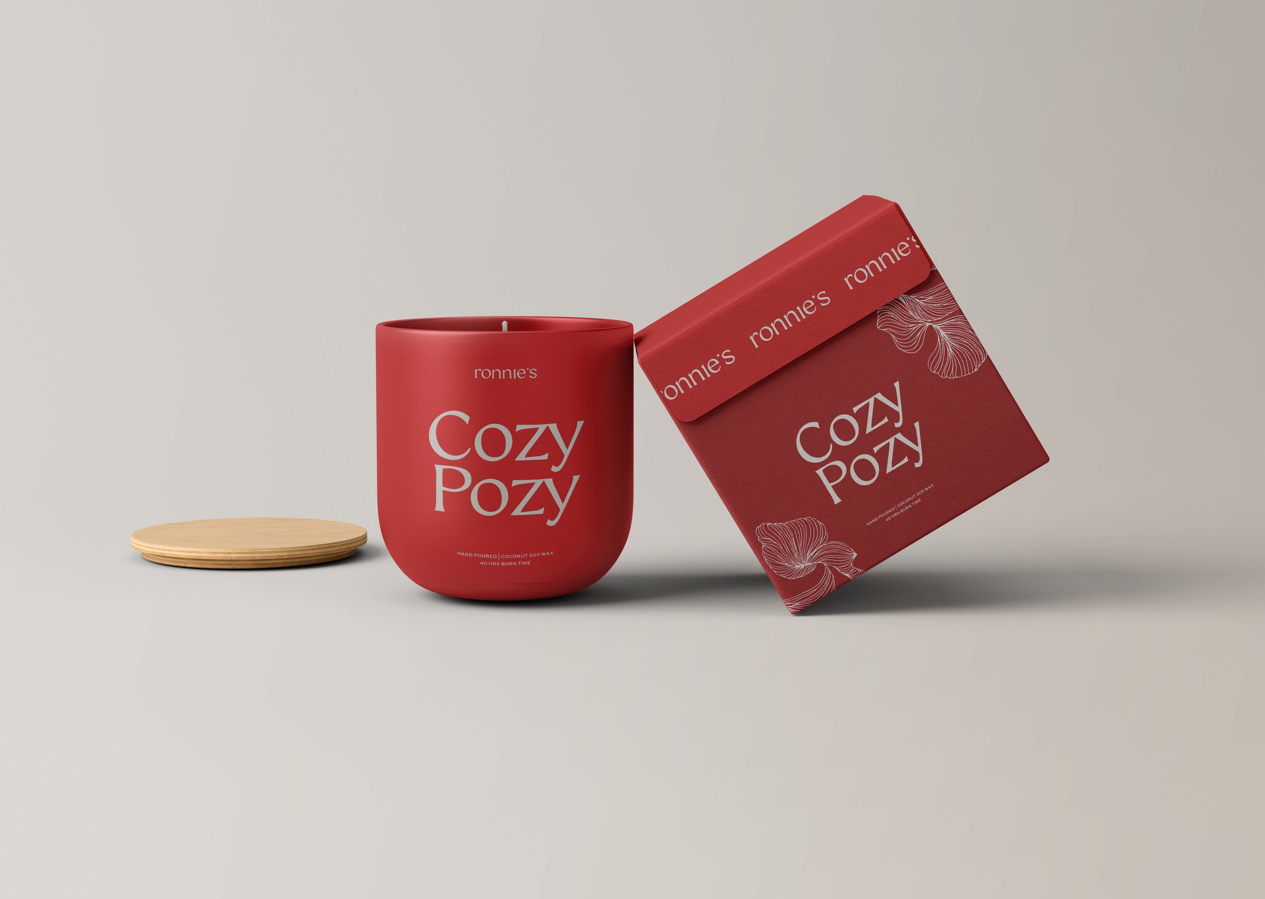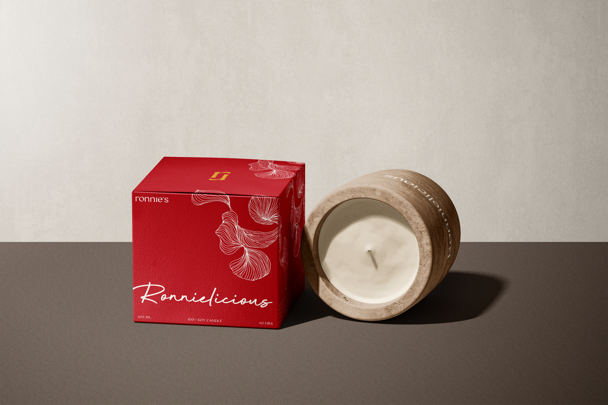
( Brand Strategy • Brand Identity • Packaging Design )
( RONNIE’S CANDLES )
Toronto, Canada
( OBJECTIVE )
To design a brand that harmonized both masculine and feminine sensuality within it’s visual identity.
( VISUAL DIRECITON )
Sensual | Contemporary | Understated | Playful
Ronnie’s Candles embodies the essence of intimate connections and elevates the ambiance through carefully crafted scents. The brand narrative emphasizes the importance of intentional feelings and relationships in our fast-paced lives, highlighting the role of scents in grounding emotions.
The mission of Ronnie's is to inspire people to live in the moment, fostering a disconnect from the daily grind and encouraging an appreciation for the simple pleasure of each other's company. The core values of trust, openness, quality, joy, and the inspiration of strong relationships set the foundation for the brand's identity.